Translate feeling into design language
Explain warmth through palette, contrast, material, light, and composition rather than one vague adjective.

ARK AI DESIGN SKILL · AI interior color mood analysis
Identify dominant and supporting colors, light, material character, furnishing, and human atmosphere, then organize those observations into a moodboard designers and brand teams can use.
The demo could not be loaded. The preview and page remain available.
Capability
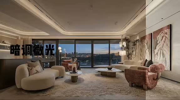
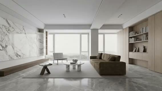
AI interior color mood analysis separates an image into dominant, supporting, and accent colors, then connects those colors with brightness, contrast, lighting, material texture, furnishing, and human activity. It helps explain why a room feels quiet, warm, restrained, energetic, theatrical, or inviting instead of returning only a few sampled swatches.
Interior and furnishing designers can organize references and build a clearer proposal narrative. Brand teams can study a campaign image or define a spatial visual direction. The analysis remains an interpretation of the source image, which may include unknown grading and display conditions. Physical color selection still needs controlled references, samples, and project lighting.
Explain warmth through palette, contrast, material, light, and composition rather than one vague adjective.
Identify recurring color and atmosphere signals across images that initially appear unrelated.
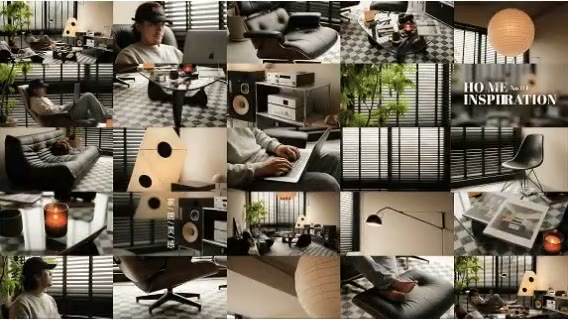
Present color, texture, light, furnishing, and audience experience as one coherent moodboard.
Carry the same atmosphere into styling, photography, merchandising, and campaign scenes.
Prepare the input
Clear source material and an explicit design objective give the model better evidence to work from. Use these checks before generation.
Select for the project’s intended character, not only for a single attractive product or trend.
Heavy grading, compression, and color casts make palette and brightness interpretation less reliable.
A full relationship between space, objects, light, and people is more useful than isolated swatches.
Clarify whether the analysis supports interiors, styling, photography, merchandising, or brand strategy.
How to use
Keep the first pass exploratory, compare alternatives, then carry the selected direction into the rest of the project.
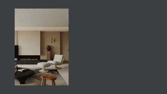
Use an image where color, light, material, and context are clear and relevant. Prepare these inputs: Upload Space Image. Include optional inputs when needed.
Set Image Ratio, Layout Style for this task, then confirm before generating.
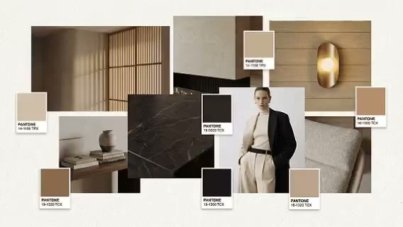
Review color hierarchy, atmosphere words, material cues, and whether they explain the source convincingly. Turn approved observations into palette ratios, material direction, lighting intent, and proposal language.
Official skill demo
This example is published for this exact skill. It is shown as one complete official reference, not as an independently verified input/output pair or a promised result for your upload.
What the AI reads
The model combines pixel color, area, brightness, contrast, texture, and scene semantics. Mood language is a design interpretation, not an objective psychological measurement.
Use the mood analysis to establish a creative direction. Confirm brand colors, printing, coatings, materials, and lighting with calibrated references and physical samples.
Practical guidance
Analyze images individually, then look for repeated temperature, value, texture, and atmosphere.
The balance between dominant, supporting, and accent colors often matters more than isolated hex values.
Soft daylight, side light, dusk, or low illumination may be essential to reproducing the mood.
Use the moodboard for direction, then translate it into real products and controlled standards.
Where it helps
Explain why references support the project instead of presenting images without analysis.
Coordinate furniture, textile, rugs, lighting, and art around one color logic.
Translate a spatial atmosphere into photography, merchandising, and content rules.
Compare color, material, and mood patterns across a visual category.
Workflow comparison
AI accelerates visual decomposition and language. Designers and color professionals add cultural context, brand strategy, calibrated standards, and material reality.
| Decision point | AI Interior Color Mood Analysis | Conventional workflow |
|---|---|---|
| Speed | Rapidly organizes color, material, and mood signals | A designer observes, samples, and synthesizes each reference |
| Interpretation | Combines visual features with scene semantics | Connects the image with user, culture, and brand strategy |
| Color accuracy | A visual approximation affected by the source | Can use calibrated displays, standards, and physical samples |
| Best output | Inspiration, proposals, and creative briefs | Specifications, material selection, and brand guidelines |
Use AI to turn references into a discussion framework, then let design judgment and real samples determine what the project should actually use.
FAQ
It can describe a close visual direction, but source and display conditions prevent reliable product matching. Use standard references and samples.
Yes. Analyze them separately, preserve their context, and compare recurring patterns instead of averaging conflicting styles.
No. They are interpretations of visual cues and common design language; audiences and cultural contexts may respond differently.
Yes as an initial visual framework, then the brand team should align it with audience, channel, and existing guidelines.
Ark AI
Start with real project material, compare a few directions, and keep developing the selected result in the Ark AI canvas.